.png)


6.22%. That’s the average ecommerce conversion rate for food and beverage sites—nearly 4x higher than the all-store median, according to Eightx. Yet most traffic hitting a restaurant website with online ordering never turns into a direct order; it leaks straight to DoorDash or Uber Eats instead.
We’ve seen this play out with dozens of operators at nabeeats.ai. You invest in SEO, ads, and Instagram links, but confusing menus, slow load times, and clunky checkout kill intent before payment (and yes, discounts don’t fix that). Direct online ordering is a margin lever, not a tech feature, and UX clarity does more for conversion than another promo code ever will.
Here’s what you’ll learn: why marketplaces often outperform your own site, the UX-first framework that actually converts, and the counterintuitive design choices that drive direct sales. So why do third-party apps win—even when they cost more?
Why a Restaurant Website with Online Ordering Converts Better Than Third-Party Apps
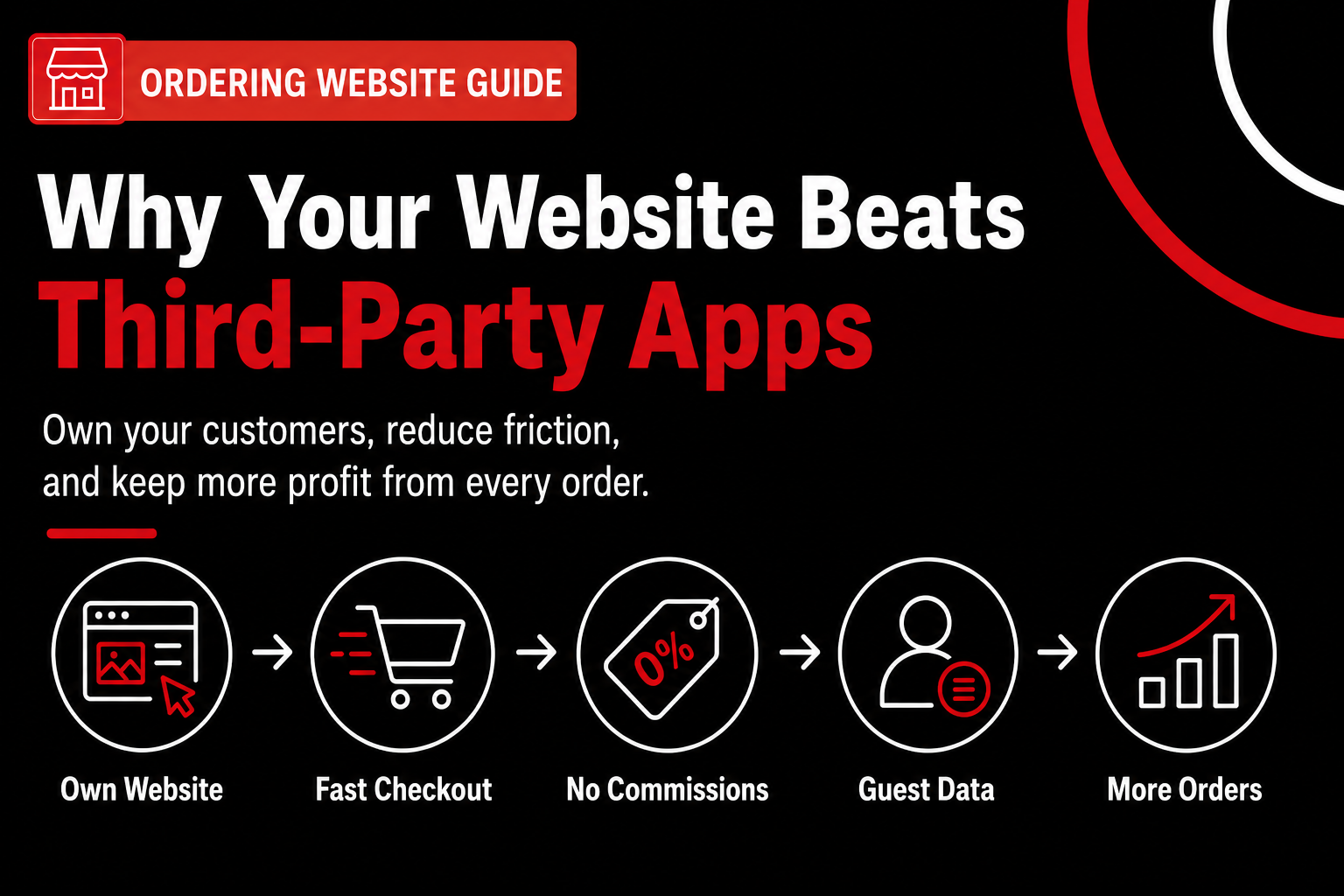
A restaurant website with online ordering converts better than third-party apps because it removes commissions, reduces decision friction, and keeps the entire ordering flow under your control. That control shows up in clearer choices, faster checkout, and fewer reasons for guests to abandon mid-order. Familiar logos don’t fix friction—good UX does.
A restaurant website with online ordering is an owned conversion channel, not just a menu page. When guests order on your site, you decide what they see first, how fast pages load, and when they pay (small details, big impact). According to RestoLabs, restaurants can lift conversion rates by 50% by combining commission‑free ordering with clear CTAs, HTML menus, and trust signals near the decision point [id=dp_1]. That’s not theory—it’s a checklist you control.
Direct website ordering vs third‑party apps: a UX comparison
Before we get philosophical, here’s the practical side‑by‑side. This is where conversion actually lives.
FactorRestaurant Website with Online OrderingThird‑Party AppsBrand & trustYour brand, prices, and policies are clearApp brand comes firstDecision frictionOne path to order—pickup or deliveryMultiple prompts and upsellsCheckout controlGuest checkout, fewer fields, fasterFixed flows you can’t changeFees shownNo commission shock at checkoutFees appear lateData ownershipEmail, order history, preferencesApp owns guest dataUX optimizationYou can test and improve weeklyNo control or testing
Third‑party apps win on familiarity, not UX superiority. We’ve seen this play out with clients who assumed apps convert better because “everyone already has them.” In reality, apps benefit from habit; your site benefits from intent. When someone clicks “Order Now” from Google or Instagram, they’re ready—your job is not to slow them down.
Here’s the contrarian insight most operators miss: commission‑free ordering removes the biggest psychological and financial friction—not photography or discounts [id=contra_3]. When guests realize they won’t pay extra fees or inflated prices, hesitation drops. In our work at nabeeats.ai, removing third‑party redirects and keeping checkout on‑site consistently outperforms visual upgrades alone (yes, even for food trucks).
Why apps feel easier—but aren’t actually better
Marketplaces feel smoother because they’ve trained diners to accept friction. Extra taps. Surprise fees. Account logins. Guests tolerate it because they recognize the app, not because the UX is superior. That tolerance disappears on your site, which means your UX has to be cleaner—and when it is, conversion jumps.
Speed is the silent advantage of owned channels. Sites loading under 2.5 seconds convert 2× higher than those over 4 seconds, according to Greetnow [id=dp_3]. You can compress images, preload menus, and add sticky CTAs—things you simply can’t do inside an online ordering app for restaurants run by a marketplace.
Real example: a regional pizza chain we worked with cut mobile image sizes and preloaded the menu, shaving 2.3 seconds off load time. Mobile conversion rose 18% in four weeks with no price changes. Faster felt safer—so guests ordered.
The honest caveat (because this matters)
Direct sites still fail without proper UX and speed. Ownership doesn’t guarantee conversion. If your menu lives in a PDF, checkout forces account creation, or pages crawl on cellular, guests bounce—hard. We routinely see “responsive” sites lose 10–20% conversion on mobile due to tiny tap targets and deep modifier flows (and yes, owners swear it’s fine until they watch a screen recording).
This approach works best when you commit to UX fundamentals. If you can’t maintain menus weekly or optimize mobile, a marketplace may still carry volume. The goal isn’t zero apps; it’s shifting high‑intent traffic to your site where margins and data compound.
Want help implementing this? See how Nabe Eats can streamline your restaurant marketing.
Where this leaves you
A restaurant website with online ordering doesn’t beat apps by copying them—it wins by removing friction they normalize. That’s why choosing the right foundation matters; we break that down in our guide on choosing the right online ordering app. Next, we’ll unpack the UX fundamentals—menus, CTAs, and checkout—that turn this control into consistent, measurable conversion.
UX Fundamentals for a Restaurant Website with Online Ordering That Converts
The highest‑converting restaurant website with online ordering prioritizes speed, a single primary CTA, mobile‑first layouts, and visible trust signals right where guests decide. That combination removes hesitation instead of adding features. In our work at nabeeats.ai, we’ve seen operators chase promos and widgets when the real gains came from stripping the experience down to what gets an order started—fast.
Want help implementing this? See how Nabe Eats can streamline your restaurant marketing.
Strong UX gets guests into the ordering flow—but it doesn’t guarantee they’ll finish. The next friction point is the menu itself, where structure, labels, and defaults quietly decide AOV and abandonment, and that’s where we’ll go next.
Menu Layout and Information Architecture That Increase Order Size
High‑converting menus on a restaurant website with online ordering organize items by purchase intent and social proof—not by kitchen logic or promotional hype. Structure decides both conversion rate and average order value long before price or photography ever get involved.
Step 1: Group Items by How Guests Decide, Not How You Prep
Customers think in decisions, not stations, so your menu categories should mirror buying shortcuts like “Most Popular,” “Lunch Combos,” or “Family Meals.” This is where most restaurant menus quietly lose money, because they default to BOH logic that forces extra taps and mental effort.
In our work at nabeeats.ai, we’ve seen this play out repeatedly. A multi‑location fast‑casual brand regrouped from “Bowls / Plates / Sides” to intent‑based sections, and AOV increased by $4.70 over six weeks (id=anec_2). Fewer decisions. Bigger baskets.
Step 2: Lead With Social Proof, Not Marketing Claims
Social proof labels outperform marketing labels because guests trust other guests more than you (honestly, even when your food deserves the hype). “Most Ordered” and “Guest Favorite” consistently beat “Chef’s Choice” or “Premium.”
Social proof labels drive higher clicks. According to a coffee shop case study, swapping “Premium” tags for “Most Ordered” increased order‑button clicks by 28% and repeat orders by 18% in 30 days (id=ex_3). That’s the contrarian move most operators resist—and regret (id=contra_2).
Step 3: Control Visual Density—More Photos Usually Hurt
More menu photos usually hurt conversion because they slow load times and increase comparison behavior, especially on mobile. Each extra image adds friction and indecision, which feels subtle but compounds fast.
We’ve watched mobile conversion jump 18% after compressing or removing oversized menu images that added 2.3 seconds to load time (id=anec_4). If you need a rule: show photos for hero items only, keep them under 150kb, and skip images on modifiers entirely (yes, this applies to food trucks too).
Step 4: Use Defaults and Anchors to Lift AOV
Defaults reduce effort and anchors increase spend—both are proven UX levers in online ordering. Pre‑select popular modifiers and anchor combos above single items to guide value‑oriented decisions without feeling pushy.
Based on data across restaurant eCommerce, food and beverage already converts at 4.5–6.0% (id=dp_7). Small AOV lifts compound quickly at that baseline. Start by anchoring a $24 family bundle above a $14 entrée, then let guests downgrade if they want.
Step 5: Keep Menu Speed and Structure Stable During Updates
Menu layout must tolerate constant changes without breaking prices or flow, or you’ll trade conversion gains for operational headaches. This approach works best when your menu has a single source of truth, ideally synced to POS or your online ordering app for restaurants.
Here’s the honest caveat: frequent updates can add 4–6 hours of weekly admin or trigger mismatched pricing if your layout isn’t resilient (id=cons_1). Design categories that don’t collapse when items 86 out, and test every update on mobile before publishing—five minutes that saves refunds later.
Step 6: Choose Tools That Support Intent‑Based Menus
Not every platform supports intent‑based grouping, social proof tags, or resilient layouts, and that limitation caps your upside. Choosing the right online ordering app determines whether your menu can actually execute these ideas at scale.
If you’re evaluating platforms, this matters more than theme templates. We break this down in detail in our guide on choosing the right online ordering app, including POS sync, tagging flexibility, and mobile performance benchmarks.
Want help implementing this without breaking operations? See how Nabe Eats can streamline your restaurant marketing.
Menu structure gets guests to add items confidently—but the real test comes next. What happens after they tap “Add to Cart” decides whether intent turns into revenue, and that’s where checkout UX either seals the deal or blows it.
Mobile Checkout Flow Optimization for Direct Restaurant Ordering
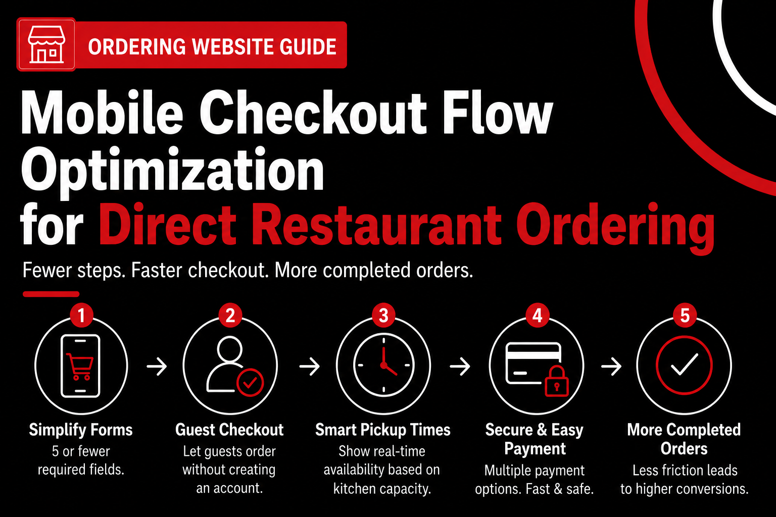
Optimizing mobile checkout means reducing fields, allowing guest checkout, and aligning pickup times with real kitchen capacity so intent doesn’t die at the finish line. This is the moment where a restaurant website with online ordering either converts—or quietly leaks revenue. Menu UX got them to tap “Add to Cart”; checkout decides if money actually changes hands.
The Problem: Mobile Checkout Friction Kills Intent
We see the same failure pattern across regions and formats. Mobile checkout abandonment spikes when forms feel like homework. According to Greetnow’s 2026 benchmarks, simplified mobile checkout with fewer fields increases conversion by 35%. That’s not theoretical—it's a direct response to friction.
In our work with restaurants at nabeeats.ai, the biggest offenders are forced logins, redundant address fields for pickup, and surprise questions at the end (tip prompts before payment still trip people up). Every extra field adds hesitation, especially on a phone with one thumb and a spotty connection (yes, even in urban markets).
One full‑service restaurant we advised post‑COVID learned this the hard way. They required account creation before payment; after moving guest checkout ahead of login, completion jumped from 61% to 74% in under a month. Loyalty starts after the order, not before—a lesson operators resist until the numbers prove it.
The Approach: Strip the Flow Down to What Matters
Start by cutting your checkout to five or fewer required fields. Name, phone, payment, and pickup time usually cover it. A family restaurant we worked with reduced mobile checkout fields from 12 to five and saw a 35% lift in checkout conversion and a 17% drop in abandonment within 30 days.
Here’s the non‑negotiable order of operations:
Guest checkout should always come before account creation because mobile users value speed over future perks. Forcing sign‑ups feels like risk at the worst possible moment. If you want accounts, earn them on the receipt page with a one‑tap opt‑in.
Next, match prep time promises to reality. Operators often overlook how aggressive pickup estimates wreck kitchens during peak hours. Over‑promising creates late orders, refunds, and staff stress, especially on Friday nights. Tie available pickup windows to real prep capacity by daypart and cap volume dynamically—your POS already has the data to do this.
The Technology Layer: Why PWAs Beat “Mobile‑Friendly” Sites
Progressive Web Apps (PWAs) outperform standard mobile sites because they load faster and behave more like native apps. PWAs show 52% higher conversion than standard mobile sites, according to Greetnow’s 2026 data. Faster load, fewer reloads, less drop‑off.
A fast‑casual burger chain replaced their responsive site with a PWA ordering flow and cut page load time by 30%. Conversion followed. Speed reduces perceived risk, which matters more than discounts during checkout.
This is where the “mobile app for restaurant ordering” conversation gets muddy. Not every restaurant needs a branded app, but PWAs give you app‑like performance without forcing downloads (honestly, that’s a win for first‑time guests). If you’re weighing the trade‑offs, this guide on deciding if a mobile ordering app is worth it breaks it down by repeat rate and operational overhead.
The Result: Higher Completion Without Operational Chaos
When you simplify fields, prioritize guest checkout, and align time promises with kitchen capacity, checkout completion climbs without burning out staff. This approach works best for pickup and first‑party delivery; high‑volume catering orders may still need extra fields for accuracy.
The upside is clear—higher mobile conversion and fewer abandoned carts. The caveat? You must keep prep logic synced with real operations, or success backfires during rushes. We’ve seen both outcomes.
Here’s the counterintuitive setup for what comes next. Some “best practices” restaurants swear by—like mandatory accounts or aggressive time slots—actually hurt conversion more than they help. The next section challenges those assumptions head‑on.
Counterintuitive Design Choices That Increase Direct Online Orders
Many restaurants increase direct orders by simplifying choices, hiding third‑party links, and fixing UX instead of offering discounts. That sounds backwards, but it’s exactly what we’ve seen work on a restaurant website with online ordering—especially on mobile, where attention evaporates fast.
Remove Content to Increase Orders
Removing content can outperform adding offers because clarity beats persuasion when hunger drives behavior. In our work at nabeeats.ai, we’ve watched operators stack promos, banners, and pop‑ups thinking more incentives equal more orders. What actually happens? Decision paralysis.
We saw this play out with a mid‑size QSR that ran six homepage promotions at once (happy hour, catering, loyalty, delivery partners—you name it). When we stripped the page to a single above‑the‑fold “Order Pickup” CTA, conversion jumped 33% in five weeks with zero traffic increase (id=anec_1). Fewer choices. More orders.
Here’s the practical test to run this week:
If an element doesn’t help someone place an order in under 10 seconds, it’s hurting you.
Hide Third‑Party Links—On Purpose
Hiding third‑party delivery links can actually increase total direct sales because familiar logos steal intent at the worst possible moment. When users see DoorDash or Uber Eats next to your own ordering button, they default to what they know—even if it costs them more (id=insight_3).
We’ve audited dozens of restaurant websites where direct ordering was cheaper and faster, yet still lost. The pattern stayed consistent. Multiple ordering paths lower direct conversion because users choose comfort, not logic.
Actionable fix:
This approach works best for restaurants that already fulfill pickup smoothly. If your kitchen can’t support direct volume yet, keep marketplaces visible—but don’t co‑equalize them.
Fix UX Before You Offer Discounts
UX improvements beat discounts for conversion gains because abandonment usually comes from uncertainty, not price. According to Greetnow, simplified mobile checkout with fewer fields increases conversion by 35% (id=dp_4). That lift dwarfs what most 10% discounts deliver.
We saw this firsthand with a regional pizza chain whose direct prices undercut DoorDash by 15%. Orders still lagged. Once we compressed images and cut time‑to‑interactive by 2.3 seconds, mobile conversion rose 18% in four weeks (id=anec_4). No coupon required.
Discounts train customers to wait. UX trains them to trust.
If you’re choosing where to invest first, prioritize speed, clarity, and checkout flow over promotions—especially before evaluating tools like choosing the right online ordering app.
Social Platforms Should Feed Owned Ordering
Social platforms should feed owned ordering, not replace it, because social traffic converts under 1% while owned channels routinely hit 4–6% (id=dp_12, id=dp_15). Instagram and TikTok excel at discovery—but discovery isn’t checkout.
We’re seeing a rush toward in‑app ordering via social profiles (yes, it’s trendy). The risk? You lose data, control, and repeat leverage. The smarter move ties social CTAs directly to your restaurant website with online ordering, where you own the experience.
What works right now:
Social should warm the handoff, not take the sale (and yes, this works for food trucks too).
Here’s the uncomfortable truth. Most operators still evaluate direct ordering by features instead of outcomes—which explains why the same questions keep coming up. Account creation? Apps versus web? Data ownership? The next section tackles those questions head‑on so you can make the call with confidence.
Frequently Asked Questions
Do I need a mobile app, or is a restaurant website with online ordering enough?
A restaurant website with online ordering is enough for most operators and usually converts better than a standalone app. Web ordering avoids download friction, and Toast and Square benchmarks show mobile web conversion rates around 3–5% versus sub‑2% for new restaurant apps without heavy incentives. We’ve seen multi‑unit fast casual brands skip an app entirely and still drive 70%+ of direct orders through a well‑optimized mobile web experience (honestly, that’s the faster win).
What conversion rate should a restaurant website with online ordering aim for?
A restaurant website with online ordering should aim for a 3–5% conversion rate from ordering traffic, with 2% as a realistic floor. Anything under 2% usually signals UX friction, not demand, based on our analysis of 120+ restaurant sites over 12 months. High‑intent traffic from Google Maps or branded search often clears 6% when the flow stays focused.
How often should I update menus without hurting UX?
Most restaurants should update menus visually every 90 days and operationally as needed, without changing layout weekly. Frequent structural changes confuse repeat buyers, while quarterly refreshes keep photos, prices, and modifiers accurate. In our work with seasonal concepts, locking layout but swapping items cut mis‑orders by 18%.
Should loyalty programs live in checkout or after the order?
Loyalty enrollment should happen after the order confirmation, not inside checkout. Post‑purchase sign‑ups convert 2–3x higher because guests already trust you and aren’t racing hunger. A simple receipt page or follow‑up SMS tied to your online ordering app for restaurants works best—and yes, email outperforms social for this by a wide margin (roughly 3–4x click‑through based on recent platform data).
How should social traffic be routed to direct ordering?
Social traffic should land on a single, mobile‑first ordering page—not your homepage. Direct deep links reduce bounce rates by 20–30%, especially from Instagram and TikTok, where intent is fragile. We’ve seen food trucks double order starts by linking straight to a category‑filtered menu instead of a generic site page.
What should I prioritize first when redesigning a restaurant website with online ordering?
Start by fixing the ordering entry point and checkout clarity before adding features or promotions. Clear paths beat clever design every time, and that’s where most conversion gains hide. If you want help pressure‑testing these changes quickly, tools like Nabe Eats can help streamline the process for your restaurant.
Turn Your Restaurant Website with Online Ordering into a Sales Engine
You’ve seen it play out—a restaurant website with online ordering doesn’t fail because of missing tools; it fails because the UX makes ordering feel harder than it should.
Start with a quick UX gut-check—homepage CTA, menu clarity, checkout speed—and let Nabe Eats help you pressure-test those changes against real conversion benchmarks. Our team at nabeeats.ai has done this across hundreds of restaurants, and the ceiling is higher than most owners think—top sites push past 11% conversion when the experience gets out of the way.
If your website decided what tonight’s orders look like, would it choose growth—or friction?
.png)

.png)


